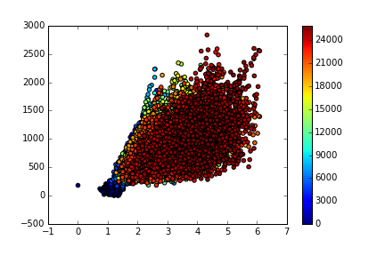
Making better scatter plot: sort data points for scatter plots to plot first most frequent data
When plotting scatter plot, less frequent data are hidden by the most frequent
ones, leading to very crowded scatter plot, reducing the readability of the
plot:
% pylab inline
data = numpy . genfromtxt ( 'test.txt' )
x = data [:, 0 ]
y = data [:, 1 ]
z = data [:, 2 ]
scatter ( x , y , c = z )
colorbar ()
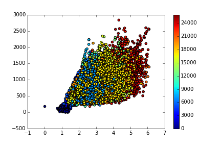
The function below sort scatter data from the less frequent one to the most
frequent using a 3D histogram:
<!DOCTYPE html>
<html>
<head>
<meta http-equiv="Content-type" content="text/html; charset=utf-8">
<meta http-equiv="Content-Security-Policy" content="default-src 'none'; style-src 'unsafe-inline'; img-src data:; connect-src 'self'">
<title>Site not found · GitHub Pages</title>
<style type="text/css" media="screen">
body {
background-color: #f1f1f1;
margin: 0;
font-family: "Helvetica Neue", Helvetica, Arial, sans-serif;
}
.container { margin: 50px auto 40px auto; width: 600px; text-align: center; }
a { color: #4183c4; text-decoration: none; }
a:hover { text-decoration: underline; }
h1 { width: 800px; position:relative; left: -100px; letter-spacing: -1px; line-height: 60px; font-size: 60px; font-weight: 100; margin: 0px 0 50px 0; text-shadow: 0 1px 0 #fff; }
p { color: rgba(0, 0, 0, 0.5); margin: 20px 0; line-height: 1.6; }
ul { list-style: none; margin: 25px 0; padding: 0; }
li { display: table-cell; font-weight: bold; width: 1%; }
.logo { display: inline-block; margin-top: 35px; }
.logo-img-2x { display: none; }
@media
only screen and (-webkit-min-device-pixel-ratio: 2),
only screen and ( min--moz-device-pixel-ratio: 2),
only screen and ( -o-min-device-pixel-ratio: 2/1),
only screen and ( min-device-pixel-ratio: 2),
only screen and ( min-resolution: 192dpi),
only screen and ( min-resolution: 2dppx) {
.logo-img-1x { display: none; }
.logo-img-2x { display: inline-block; }
}
#suggestions {
margin-top: 35px;
color: #ccc;
}
#suggestions a {
color: #666666;
font-weight: 200;
font-size: 14px;
margin: 0 10px;
}
</style>
</head>
<body>
<div class="container">
<h1>404</h1>
<p><strong>There isn't a GitHub Pages site here.</strong></p>
<p>
If you're trying to publish one,
<a href="https://help.github.com/pages/">read the full documentation</a>
to learn how to set up <strong>GitHub Pages</strong>
for your repository, organization, or user account.
</p>
<div id="suggestions">
<a href="https://githubstatus.com">GitHub Status</a> —
<a href="https://twitter.com/githubstatus">@githubstatus</a>
</div>
<a href="/" class="logo logo-img-1x">
<img width="32" height="32" title="" alt="" src="data:image/png;base64,iVBORw0KGgoAAAANSUhEUgAAACAAAAAgCAYAAABzenr0AAAAGXRFWHRTb2Z0d2FyZQBBZG9iZSBJbWFnZVJlYWR5ccllPAAAAyRpVFh0WE1MOmNvbS5hZG9iZS54bXAAAAAAADw/eHBhY2tldCBiZWdpbj0i77u/IiBpZD0iVzVNME1wQ2VoaUh6cmVTek5UY3prYzlkIj8+IDx4OnhtcG1ldGEgeG1sbnM6eD0iYWRvYmU6bnM6bWV0YS8iIHg6eG1wdGs9IkFkb2JlIFhNUCBDb3JlIDUuMy1jMDExIDY2LjE0NTY2MSwgMjAxMi8wMi8wNi0xNDo1NjoyNyAgICAgICAgIj4gPHJkZjpSREYgeG1sbnM6cmRmPSJodHRwOi8vd3d3LnczLm9yZy8xOTk5LzAyLzIyLXJkZi1zeW50YXgtbnMjIj4gPHJkZjpEZXNjcmlwdGlvbiByZGY6YWJvdXQ9IiIgeG1sbnM6eG1wPSJodHRwOi8vbnMuYWRvYmUuY29tL3hhcC8xLjAvIiB4bWxuczp4bXBNTT0iaHR0cDovL25zLmFkb2JlLmNvbS94YXAvMS4wL21tLyIgeG1sbnM6c3RSZWY9Imh0dHA6Ly9ucy5hZG9iZS5jb20veGFwLzEuMC9zVHlwZS9SZXNvdXJjZVJlZiMiIHhtcDpDcmVhdG9yVG9vbD0iQWRvYmUgUGhvdG9zaG9wIENTNiAoTWFjaW50b3NoKSIgeG1wTU06SW5zdGFuY2VJRD0ieG1wLmlpZDpFMTZCRDY3REIzRjAxMUUyQUQzREIxQzRENUFFNUM5NiIgeG1wTU06RG9jdW1lbnRJRD0ieG1wLmRpZDpFMTZCRDY3RUIzRjAxMUUyQUQzREIxQzRENUFFNUM5NiI+IDx4bXBNTTpEZXJpdmVkRnJvbSBzdFJlZjppbnN0YW5jZUlEPSJ4bXAuaWlkOkUxNkJENjdCQjNGMDExRTJBRDNEQjFDNEQ1QUU1Qzk2IiBzdFJlZjpkb2N1bWVudElEPSJ4bXAuZGlkOkUxNkJENjdDQjNGMDExRTJBRDNEQjFDNEQ1QUU1Qzk2Ii8+IDwvcmRmOkRlc2NyaXB0aW9uPiA8L3JkZjpSREY+IDwveDp4bXBtZXRhPiA8P3hwYWNrZXQgZW5kPSJyIj8+SM9MCAAAA+5JREFUeNrEV11Ik1EY3s4+ddOp29Q5b0opCgKFsoKoi5Kg6CIhuwi6zLJLoYLopq4qsKKgi4i6CYIoU/q5iDAKs6syoS76IRWtyJ+p7cdt7sf1PGOD+e0c3dygAx/67ZzzPM95/877GYdHRg3ZjMXFxepQKNS6sLCwJxqNNuFpiMfjVs4ZjUa/pmmjeD6VlJS8NpvNT4QQ7mxwjSsJiEQim/1+/9lgMHgIr5ohuxG1WCw9Vqv1clFR0dCqBODElV6v90ogEDjGdYbVjXhpaendioqK07CIR7ZAqE49PT09BPL2PMgTByQGsYiZlQD4uMXtdr+JxWINhgINYhGT2MsKgMrm2dnZXgRXhaHAg5jEJodUAHxux4LudHJE9RdEdA+i3Juz7bGHe4mhE9FNrgwBCLirMFV9Okh5eflFh8PR5nK5nDabrR2BNJlKO0T35+Li4n4+/J+/JQCxhmu5h3uJoXNHPbmWZAHMshWB8l5/ipqammaAf0zPDDx1ONV3vurdidqwAQL+pEc8sLcAe1CCvQ3YHxIW8Pl85xSWNC1hADDIv0rIE/o4J0k3kww4xSlwIhcq3EFFOm7KN/hUGOQkt0CFa5WpNJlMvxBEz/IVQAxg/ZRZl9wiHA63yDYieM7DnLP5CiAGsC7I5sgtYKJGWe2A8seFqgFJrJjEPY1Cn3pJ8/9W1e5VWsFDTEmFrBcoDhZJEQkXuhICMyKpjhahqN21hRYATKfUOlDmkygrR4o4C0VOLGJKrOITKB4jijzdXygBKixyC5TDQdnk/Pz8qRw6oOWGlsTKGOQW6OH6FBWsyePxdOXLTgxiyebILZCjz+GLgMIKnXNzc49YMlcRdHXcSwxFVgTInQhC9G33UhNoJLuqq6t345p9y3eUy8OTk5PjAHuI9uo4b07FBaOhsu0A4Unc+T1TU1Nj3KsSSE5yJ65jqF2DDd8QqWYmAZrIM2VlZTdnZmb6AbpdV9V6ec9znf5Q7HjYumdRE0JOp3MjitO4SFa+cZz8Umqe3TCbSLvdfkR/kWDdNQl5InuTcysOcpFT35ZrbBxx4p3JAHlZVVW1D/634VRt+FvLBgK/v5LV9WS+10xMTEwtRw7XvqOL+e2Q8V3AYIOIAXQ26/heWVnZCVfcyKHg2CBgTpmPmjYM8l24GyaUHyaIh7XwfR9ErE8qHoDfn2LTNAVC0HX6MFcBIP8Bi+6F6cdW/DICkANRfx99fEYFQ7Nph5i/uQiA214gno7K+guhaiKg9gC62+M8eR7XsBsYJ4ilam60Fb7r7uAj8wFyuwM1oIOWgfmDy6RXEEQzJMPe23DXrVS7rtyD3Df8z/FPgAEAzWU5Ku59ZAUAAAAASUVORK5CYII=">
</a>
<a href="/" class="logo logo-img-2x">
<img width="32" height="32" title="" alt="" src="data:image/png;base64,iVBORw0KGgoAAAANSUhEUgAAAEAAAABACAYAAACqaXHeAAAAGXRFWHRTb2Z0d2FyZQBBZG9iZSBJbWFnZVJlYWR5ccllPAAAAyRpVFh0WE1MOmNvbS5hZG9iZS54bXAAAAAAADw/eHBhY2tldCBiZWdpbj0i77u/IiBpZD0iVzVNME1wQ2VoaUh6cmVTek5UY3prYzlkIj8+IDx4OnhtcG1ldGEgeG1sbnM6eD0iYWRvYmU6bnM6bWV0YS8iIHg6eG1wdGs9IkFkb2JlIFhNUCBDb3JlIDUuMy1jMDExIDY2LjE0NTY2MSwgMjAxMi8wMi8wNi0xNDo1NjoyNyAgICAgICAgIj4gPHJkZjpSREYgeG1sbnM6cmRmPSJodHRwOi8vd3d3LnczLm9yZy8xOTk5LzAyLzIyLXJkZi1zeW50YXgtbnMjIj4gPHJkZjpEZXNjcmlwdGlvbiByZGY6YWJvdXQ9IiIgeG1sbnM6eG1wPSJodHRwOi8vbnMuYWRvYmUuY29tL3hhcC8xLjAvIiB4bWxuczp4bXBNTT0iaHR0cDovL25zLmFkb2JlLmNvbS94YXAvMS4wL21tLyIgeG1sbnM6c3RSZWY9Imh0dHA6Ly9ucy5hZG9iZS5jb20veGFwLzEuMC9zVHlwZS9SZXNvdXJjZVJlZiMiIHhtcDpDcmVhdG9yVG9vbD0iQWRvYmUgUGhvdG9zaG9wIENTNiAoTWFjaW50b3NoKSIgeG1wTU06SW5zdGFuY2VJRD0ieG1wLmlpZDpEQUM1QkUxRUI0MUMxMUUyQUQzREIxQzRENUFFNUM5NiIgeG1wTU06RG9jdW1lbnRJRD0ieG1wLmRpZDpEQUM1QkUxRkI0MUMxMUUyQUQzREIxQzRENUFFNUM5NiI+IDx4bXBNTTpEZXJpdmVkRnJvbSBzdFJlZjppbnN0YW5jZUlEPSJ4bXAuaWlkOkUxNkJENjdGQjNGMDExRTJBRDNEQjFDNEQ1QUU1Qzk2IiBzdFJlZjpkb2N1bWVudElEPSJ4bXAuZGlkOkUxNkJENjgwQjNGMDExRTJBRDNEQjFDNEQ1QUU1Qzk2Ii8+IDwvcmRmOkRlc2NyaXB0aW9uPiA8L3JkZjpSREY+IDwveDp4bXBtZXRhPiA8P3hwYWNrZXQgZW5kPSJyIj8+hfPRaQAAB6lJREFUeNrsW2mME2UYbodtt+2222u35QheoCCYGBQligIJgkZJNPzgigoaTEj8AdFEMfADfyABkgWiiWcieK4S+QOiHAYUj2hMNKgYlEujpNttu9vttbvdw+chU1K6M535pt3ubHCSyezR+b73eb73+t7vrfXsufOW4bz6+vom9/b23ovnNNw34b5xYGAgODg46Mbt4mesVmsWd1qSpHhdXd2fuP/Afcput5/A88xwymcdBgLqenp6FuRyuWV4zu/v759QyWBjxoz5t76+/gun09mK5xFyakoCAPSaTCazNpvNPoYVbh6O1YKGRF0u13sNDQ27QMzfpiAAKj0lnU6/gBVfAZW2WWpwwVzy0IgP3G73FpjI6REhAGA9qVRqA1b9mVoBVyIC2tDi8Xg24+dUzQiAbS/s7Ox8G2o/3mKCC+Zw0efzPQEfcVjYrARX3dbV1bUtHo8fMgt42f+Mp0yUTVQbdWsAHVsikdiHkHaPxcQXQufXgUBgMRxme9U0AAxfH4vFvjM7eF6UkbJS5qoQwEQGA57Ac5JllFyUVZZ5ckUEgMVxsK2jlSYzI+QXJsiyjzNEAJyJAzb/KQa41jJKL8pODMQiTEAymXw5n8/P0IjD3bh7Rgog59aanxiIRTVvV/oj0tnHca/WMrVwODwB3raTGxzkBg/gnZVapFV62Wy2n5AO70HM/5wbJ0QnXyQSaVPDIuNZzY0V3ntHMwxiwHA0Gj2Np7ecIBDgaDAYXKCQJM1DhrgJ3nhulcPbl8j4NmHe46X/g60fwbz3aewjkqFQaAqebWU1AOqyQwt8Id6qEHMc97zu7u7FGGsn7HAiVuosVw7P35C1nccdgSCxop1dHeZswmfHMnxBo6ZTk+jN8dl/vF7vWofDsa+MLN9oEUBMxOb3+1eoEsBVw6Zmua49r8YmhAKDiEPcMwBsxMiqQ+ixzPFxZyqRpXARG/YOr1ObFJ0gUskXBbamcR1OKmMUvDxHRAu8/LmY3jFLMUpFqz9HxG65smYJdyKyECOxDiEAe/p1gjF2oonivZAsxVgl2daa4EQWCW6J55qFAFFZiJWYLxNQy2qOSUzGRsyXCUDIeliwAHEO4WSlWQBRFoZakXcKmCXmyXAKs0Ve9vl8q42WoIYpJU4hV3hKcNs8m9gl7p/xQ73eF5kB4j5mNrWmTJRNwAzqiV1CxjVTZCIkEq+Z1bZFZSN2CenmVAFVy4Plz8xKAGWjjAKFk6lCBMDR/MJjLLMSQNm43xAiQKTaA+9/wewhDjL+JVI1kkTSSOTcKbMTwPqESAot6dn6Fr1gHwVJju6IRuyiByPuUUBAg5DGkAgBmxlvdgIEK9gDkohdY/BJo4CAG0R8miRSsGABkgVQs4KXu098IgUXSSRsFAoKZiVAVDY2WUiiPTjYRi41KwGisrGsLtlsth8Fiwnz2fBkQvWfRtlE3iF2yW63/yCacXZ1dW02GwGyTFaRd4idJnCKHRaCxYRHoG5LTKT6SyiToP1fJHbmAYPYRR0UnZQtMnA6s0zg+GZBlt0Gdo7EPHgpE3Q6nZ8YyLhc8Xj8MJh/aKTAY+5FPAKHLE7RdwuYJZmNwzyCMkBCYyKROJBMJl9B/PXXCjjmCmDOVzH3fiPpObEWGqoKe4EBl8v1hlqsdLvd23mkxHM9pc9kMpmno9HoeTii7ewbHEZPPx1ztLS1tV3AnGuMjiNjvbQFuHw6zDo5By7dTPAQNBgMLrRarTkSls1mnwT7uwp9virx9QzbW/HuV/j5d/b+6jniKlllP8lkeONJDk+dq9GsQTnC4fB1heO0K47Hwe7WdDr9nAKgXwOBwHI+C45Htj1d6sd429TUNEcmUdc+PRaLHcvn87dXW4ugzdsaGxufL94NFv9zi1J7GVbhlvb2dnaJ3SVrxfc+n2+NTsZ7/H7/Mr3g5XdSIHyJSH1PZ+7fToyl2+ErqilgZ4NaLYB9goVGaHjR93Hv1ZrU4XDsFT20kH3PObzbWk0CgG1jacVIUnAQb9F+VexyLMzkpcLv0IJV7AHQIOCAUYHx7v5qgScmYHtTqSAyZLEJTK22Bie4iq3xsqpm4SAf9Hq9a2DnJ4uLK3SEULcdRvp3i3zHySqpficxEdsQc1NrlYXXvR+O7qASSezXB+h1SuUomgg9LL8BUoV4749EIolKh+EiqWmqVEZlDgHks2pxHw7xTqUQw9J5NcAXOK10AGIoZ6Zli6JY6Z1Q461KoZ4NiKLHarW+KDsxlDUPHZ5zPQZqUVDPJsTqb5n9malbpAh8C2XXDLl62+WZIDFRUlNVOiwencnNU3aQEkL+cDMSoLvZo2fQB7AJssNAuFuvorlDVVkkg2I87+jo2K2QAVphDrfyViK5VqtO34OkaxXCp+7drdDBCAdubm6eidX+2WwqT5komwh4YQLk+H4aE93h8Xg2gvHekQZOGSgLZTLyDTLJ4Lx9/KZWKBSainT4Iy3FqQBfnUZR42PKQFksBr9QKVXCPusD3OiA/RkQ5kP8qV/Jl1WywAp/6+dcmPM2zL1UrUahe4JqfnWWKXIul3uUbfP8njAFLW1OFr3gdFtZ72cNH+PtQT7/brW+NXqJAHh0y9V8/U/A1U7AfwIMAD7mS3pCbuWJAAAAAElFTkSuQmCC">
</a>
</div>
</body>
</html>
data_sorted = sort_scatter_data ( data )
x = data_sorted [:, 0 ]
y = data_sorted [:, 1 ]
z = data_sorted [:, 2 ]
scatter ( x , y , c = z )
colorbar () The resulting graph shows a larger range of z-values depicted by the colorbar:
If you want to ask me a question or leave me a message add @bougui505 in your comment.